
- in Market Timing , Research by Cesar Alvarez
The 30% Selloff Signal: What History Tells Us About Market Recoveries
I was talking to my trading buddy and he mentioned that he read that 40% of Russell 3000 stocks are 30% or more off their 52-week high. To us that sounded really bad. But as usual, we asked is it? Or is this normal when we finally cross under the 200-day moving average after a long time being above it.
Going into this, I had lots of questions. How is this stat on the S&P500 stocks? How has the market done 6 to 12 months later compared to the average? Is the difference in performance significantly different from the average? Do we have enough occurrences of this pattern?
The Test
The test is from 1991 because that is how far back I have data.
These are the conditions I looked for
- The first day S&P500 index closed under the 200-day moving average in 6 months or more
- On this day, calculate the percentage of stocks in the index (either Russell 3000 or S&P 500) that are 30% or more from their 52-week high
- How did the S&P500 do 3, 6, & 12 months later?
Why the first time in 6 months? I wanted to capture the situation we are now in which is the market has been above the 200-day moving average for a long time. I started with 12 months but that gave too few signals. Six-months gave me enough to work with.
Why 30%? Not sure why the original person chose this value but it seems reasonable. The number represents a significant sell-off in a stock.
Russell 3000 Index
First, we start with the Russell 3000 index.
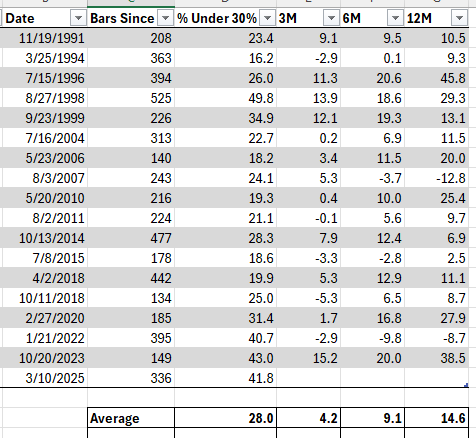
Table explanation. Date column is the first day under the 200-day moving average in over 6 months. Bars Since is how many trading day it has been since S&P500 index was under the 200-day moving average. % Under 30% is the percentage of stock trading over 30% below their 52-week high. 3M/6M/12M is the percent return of the $SPX 3/6/12 months later. The Average row is the average values of the table values above it. The Avg All row is the average return of the index on all days. This is our baseline.
We have 17 occurrences. With an average of 28% of stocks over 30% sold off. Our current situation is significantly worse. The returns for all time periods seem significantly higher. This surprised me. But is the return that much more?
Next, I calculated the Z-score of the returns compared to the standard deviation of all the returns.
These are small Z scores. Even though the returns are bigger than average they are not that big when compared to the standard deviation of all returns.
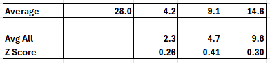
S&P500 Index
When looking at future $SPX returns, I like to focus on the $SPX index for the indicator. Does this pattern hold here?
Yes, the pattern holds, though with a much smaller percentage of stocks sold off. The recent cross on March 10 with 15.5% is higher than average. And we can see average returns for the signal is much higher than average. But again, the Z score is not that high.
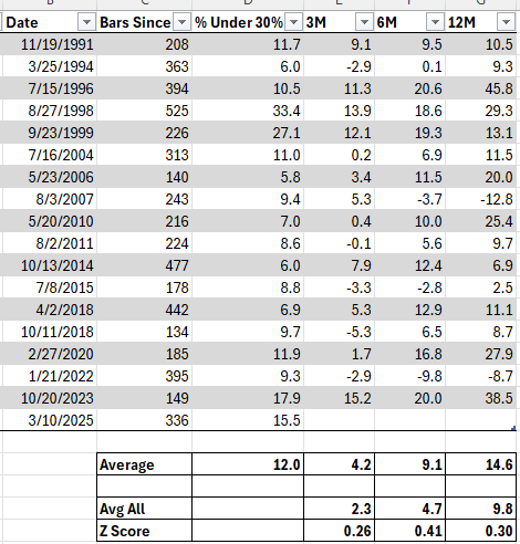
Looking at the data, it looked like splitting into two groups might give new insights. I split the data below 10% and above 10%.
S&P500 Index – 2 Buckets
The table now has been sorted by % Under 30%. The new table shows the results for the two buckets. We can now see that when over 10% of the stocks have sold off, we have significantly higher returns. The Z-score is now close to 1 which is good to see.
Russell 3000 Index – 2 Buckets
Does the pattern hold for the Russell 3000? This time I did a cutoff of less than 25% and greater than or equal to 25%.
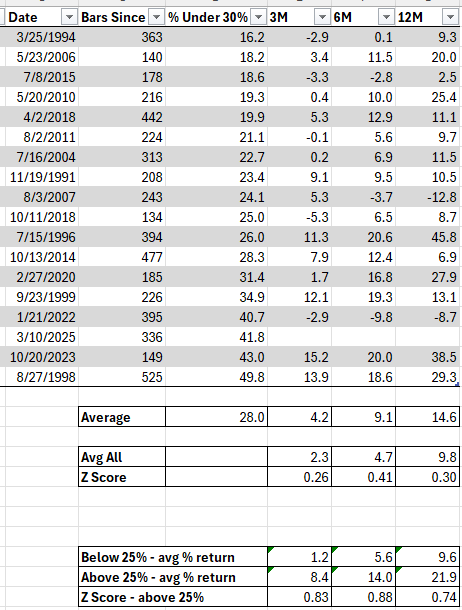
The same pattern holds though the Z-score is not as high.
Final Thoughts
Very rarely when I hear about random market facts do they actually show anything interesting once I dig into them. First, the caveat that this signal has occurred only 17 times since 1991. Not a big sample size. And then when I did the two buckets, we got down to 7 signals.
Given all that, I am surprised by the general results. I also like that the results are not all bunched up in one timeframe. As much as the markets have sold off lately, this signal tells us that the market will probably be up significantly 3, 6 & 12 months from now.
The next time market headlines spark fear, remember this pattern: sometimes the market’s darkest moments—when many stocks are significantly off their highs—have historically preceded the brightest returns.
Backtesting platform used: AmiBroker. Data provider: Norgate Data (referral link)
Good quant trading,