The Health of Stock Mean Reversion: Reader’s Ideas

My previous post The Health of Stock Mean Reversion: Dead, Dying or Doing Just Fine generated good reader’s suggestions on other ways to check on mean reversion health. Let us see what these tests tell us.

The Base Test

Date Range: 1/1/1995 to 6/30/2015.

Entry:

  • Stock is part of the Russell 1000
  • Close > $1
  • RSI(2) < 5
  • Entry on Close

Exit:

  • RSI2 > 70
  • Exit on Close


Bunching of Oversold Opportunities

This idea is that even though the number of stocks selling of each years is about the same, they are occurring more on the same day as opposed to spread out throughout the year.

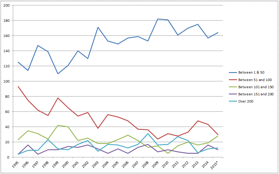
For each year, I counted the number of days with stocks that had entry signals within a range.

150916a

Note: I double the value for 2015 since it was only a half a year of data.

The top blue line represents how many trading days each year there were between 1 and 50 entry signals. This line is up. The red line which is the number of days between 51 and 100 signals is clearly down. All the other lines are trendless. One way to read this is that we are getting a little more bunching. What are your thoughts? Put them in the comments below.


Mean Reversion is Correlating with the Market

Are we getting more trades on the days that the market sells off?

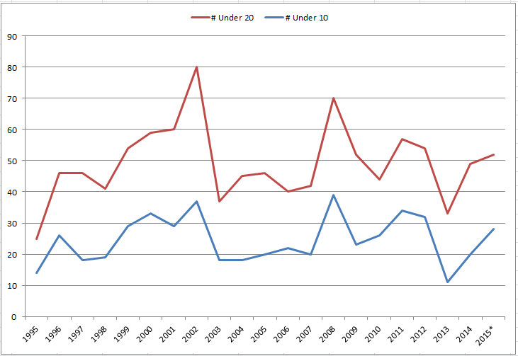
First let us look at if the market, the SPY for this example, is selling off more or less. Are we seeing more days with RSI2 less than 10 or 20?

150916b

Note: I double the value for 2015 since it was only a half a year of data.

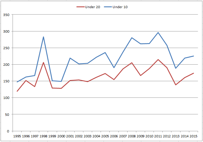
The trend has been flat. Then let us see how many setups we are getting on these days that the SPY is sold off.

150916c

Here we see a slight trend up. It appears that mean reversion is bunching up very slightly from this chart but it could just be noise.


Five Day Hold – All vs RSI2<5 vs RSI2>95

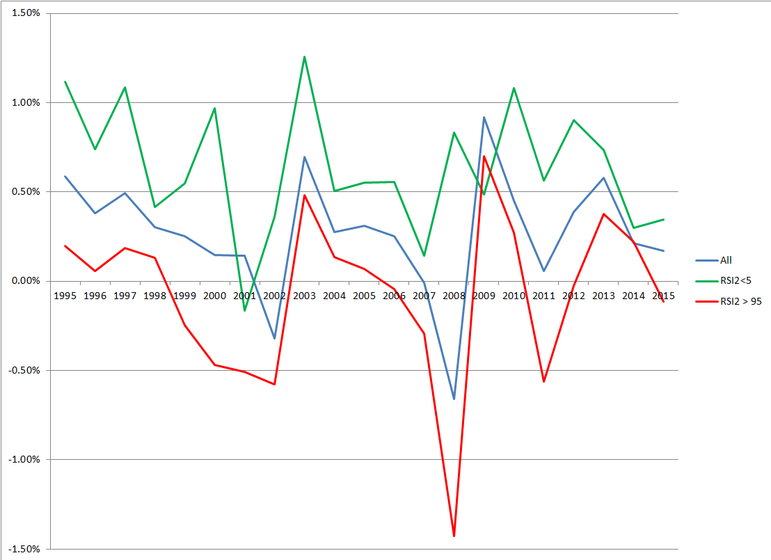
Another idea was how have the returns for RSI2 < 5 compare to the average of all stocks. Along with how did this compare to if you change RSI2<5 to RSI2>95. To do this comparison, I change the exit to a 5 day hold.

150916d

If mean reversion is working on both the long and short side, one would be expect the order of the lines from top to bottom to be green, blue and red. In most years this is the case. From this point of view mean reversion is OK.

Spreadsheet

Fill the form below to get the spreadsheet with the yearly numbers used to generate this data.

Final Thoughts

These were good tests to run but none gave any solid proof that mean reversion is dying. Have the edges shrunk yes. Are they to where it is not worth trading, not in my opinion.

Tell Me

Tell me in the comments how you read these charts and the health of mean reversion.

Backtesting platform used: AmiBroker. Data provider:Norgate Data (referral link)

Good quant trading,

Fill in for free spreadsheet:

spreadsheeticon

 
Visited 24 times, 1 visit(s) today

Click Here to Leave a Comment Below

Jimmy - September 16, 2015 Reply

Pardon my rambling, I don’t filter myself when thinking “out loud”.

This is neat, actually. On my own studies, I have found that on “daily bars”, mean reversion is ranging, and non-mean reverting is trending. As I understand it, volatility is mean reverting, but price isn’t necessarily. My point is, maybe mean reversion works optimally in chop, and momentum (or whatever magical name ppl want to use) works in trending. I know that may seem obvious to some, but perhaps the key is shutting this system OFF in trending environments? Or even better – use THIS as the indicator of momentum/mean reverting environments? I know on another blog, there’s something called “momersion” which makes differentiating the two it’s primary goal.

Hopefully something in that paragraph made sense, ha!

Jimmy

Matt - September 16, 2015 Reply

Could you elaborate on your conclusion that the first chart indicates that there is more bunching of mean reversion signals? It seems to me that if we have more days with a few signals (<50) and fewer days with a lot of signals (51-100), then the signals are becoming more evenly distributed, i.e. less bunched up.

    Cesar Alvarez - September 16, 2015 Reply

    I had problems deciding how to interpret this chart. What you say is one way. Here is how I came to my conclusion. In the past we had about 120 days with 20 signals. Now we are have about 160 days with 20 signals. This to me says we are seeing more days where the signals are bunching. All that assumes that the days with less than 50 signals are not days when the market is sold off. Make any sense? Like I said I had a hard time with this chart. I do see your point and could easily convince myself of it.

      Cesar Alvarez - September 17, 2015 Reply

      Testing of comments. Ignore this

Quantocracy's Daily Wrap for 09/16/2015 | Quantocracy - September 16, 2015 Reply

[…] The Health of Stock Mean Reversion: Reader s Ideas [Alvarez Quant Trading] My previous post The Health of Stock Mean Reversion: Dead, Dying or Doing Just Fine generated good readers suggestions on other ways to check on mean reversion health. Let us see what these tests tell us. The Base Test Date Range: 1/1/1995 to 6/30/2015. Entry: Stock is part of the Russell 1000 Close > $1 RSI(2) […]

MP - September 17, 2015 Reply

I think the 5-day hold chart might be easier to read as table. Just glancing at it, though, it looks like 2013-2014 were indicating decay — the worst non-crash years for reversion in your sample. That’s a bit of a red flag to me, even if 2015 has been nice thus far.

Would be interested to see RSI < 5 vs. [some relatively equal-weighted index] for a 5-day hold over the years. Thanks.

    Cesar Alvarez - September 17, 2015 Reply

    You can download the spreadsheet and see the data used to create the chart. I do agree that MR looks like it how come down a bit but not enough to worry me yet.

IMHO BEST LINKS FROM QUANTOCRACY FOR THE WEEK 14 SEP 15 — 20 SEP 15 | Quantitative Investor Blog - September 17, 2015 Reply

[…] The Health of Stock Mean Reversion: Reader’s Ideas […]

david varadi - September 19, 2015 Reply

hi Cesar, good work as always. Just looking at the average correlation or average downside correlation of the typical Russell 1000 stock to the S&P500 using a 252-day lookback should clearly demonstrate a positive trend over time. you can also run the correlation to the RSI versus returns which gives a more continuous representation of signal correlation.
it would be interesting to compare the signal performance when there are divergences between the S&P500 and the stock – i suspect that such situations will have lower trade returns and profit factor (but i haven’t tested this).
best
david

Duk2 - September 20, 2015 Reply

Very interesting analysis for mean reversion traders
Regards,

Leave a Reply: