- in Mean Reversion , Research , Stocks by Cesar Alvarez
The Health of Stock Mean Reversion: Dead, Dying or Doing Just Fine
My second post on this blog was a look at mean reversion, Is mean reversion dead? Given I am using a new data provider(Norgate Data), it has been almost two years since that post and there have been other articles on this recently, I figured it was time to check again. The research will focus on Russell 1000 stocks since 1995. The test is back to 1995 covers 3 bull markets and 2 bear markets.
Even though I tested back to 1995, because of the large spreads back then, I would take those results with a grain of salt.
The Test
Date Range: 1/1/1995 to 6/30/2015.
Entry:
- Stock is part of the Russell 1000
- Close > $1
- RSI(2) < 5
- Entry on Close
Exit:
- RSI2 > 70
- Exit on Close
I performed an “All Days” test. This means we can have multiple entries in the same stock at the same time. In a situation where an oversold stock continues on a journey downward day after day, the test will take each trade each day as a new independent trade if the stock continues to meet the filter criteria.
The Results
Number of trades
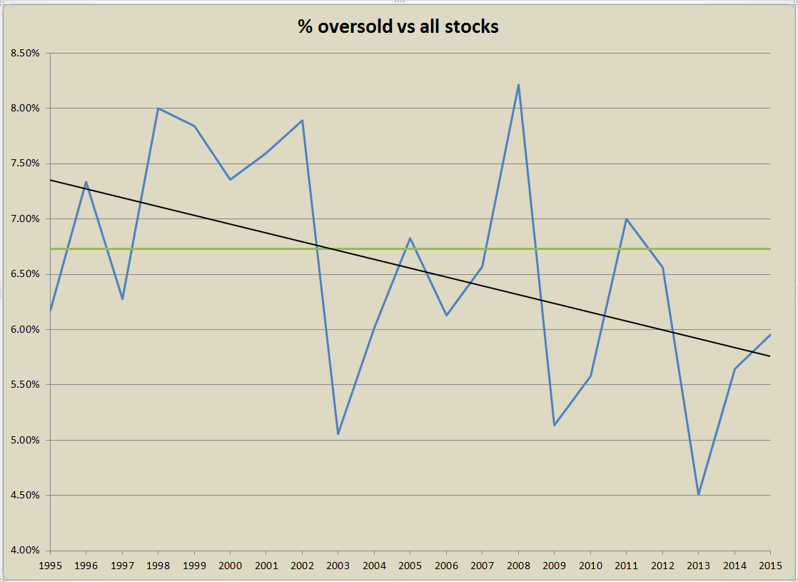
The first question is as a percentage is there fewer stocks becoming oversold?
The blue line is the percent of stocks with RSI2 < 5 compared to all the stock for a given year. This has hovered between 4.5% in 2013 and 8.2% in 2008. The black line is a liner regression of the data. We can see that the trend has been down since 1995. The green line is the average of 6.7%. Stocks are becoming less oversold.
Average % profit/loss
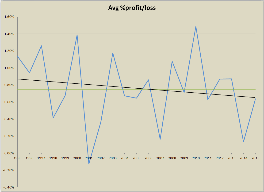
What has been happening to the average % profit/loss over the years?
The blue line is the average % profit/loss of all the trades with RSI2 < 5 and the exiting when RSI2 > 70. The black line is a linear regression of the data, which is barely sloping down. The green average line is at .75%. The 2014 number of .13% surprised me on how low it was. From this point of view, I don’t see anything that says mean reversion is dying or dead.
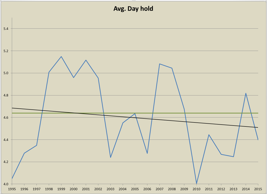
Average Day Hold
Looking at the average holding period, we can see a basically flat linear regression with a fairly tight range of holding period between 4.1 and 5.1 bars. No real changes over the years.
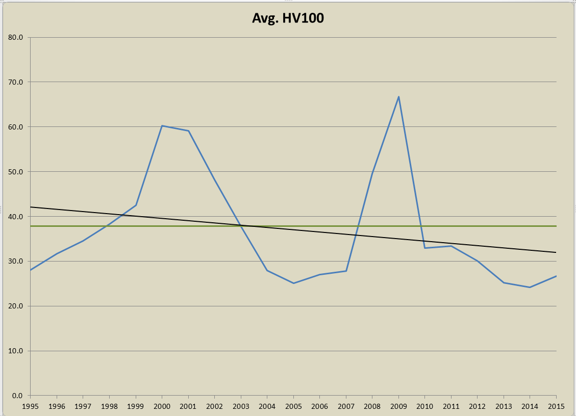
100 Day Historical Volatility
Are stocks not as volatile?
The volatility of stocks during bull market years seems be a range of about 28 to 35. Even though the regression slope is down it is only slightly. I see nothing to worry about.
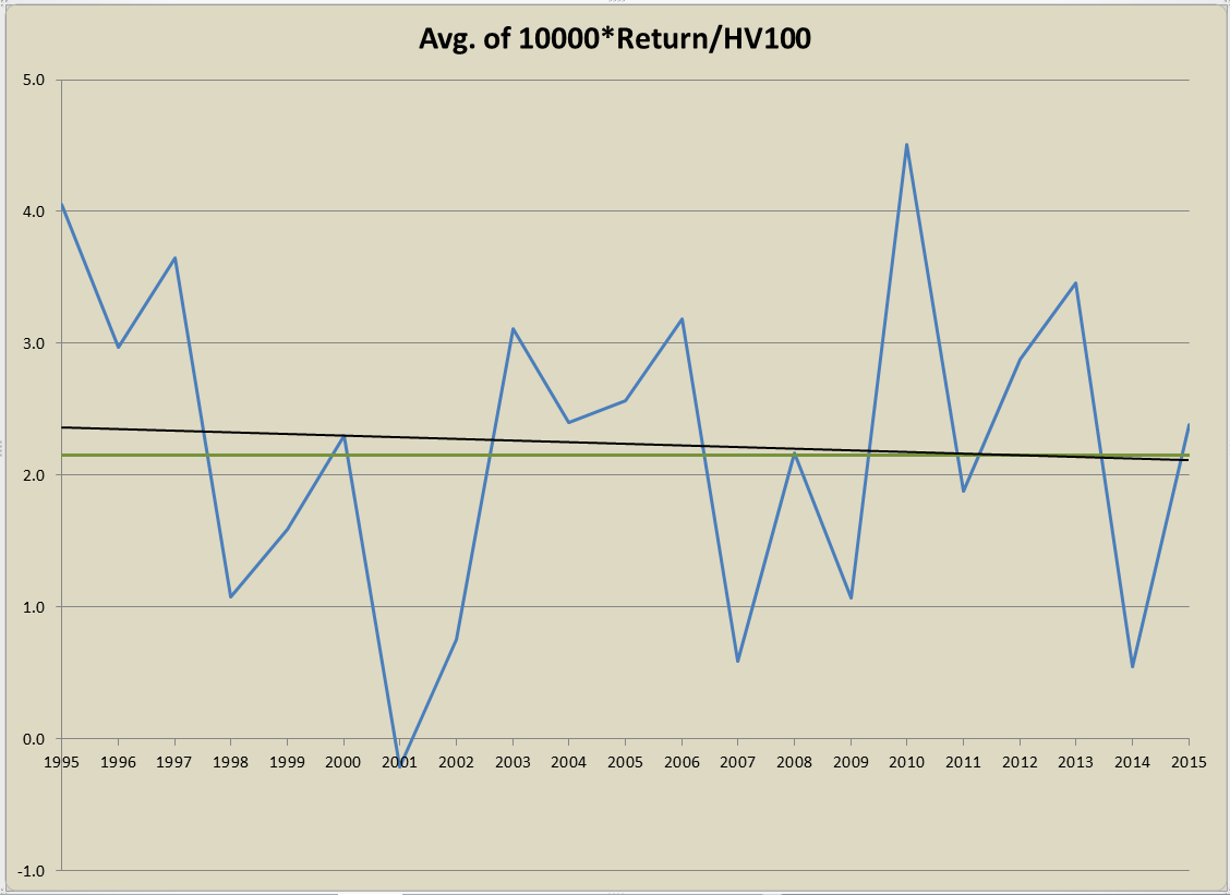
Ratio of Return to HV100
Maybe the return per unit of volatility is changing? For example a 2% return of a stock with a HV100 of 20 differs from a 2% return with a HV100 of 50.
The chart is showing the average of the return divided by HV100, then multiplied by 10,000. The 10,000 is used to give nicer looking numbers. I am not sure how to interpret this one. The numbers in late 1990’s are lower than expect but the mid 90’s are higher. An interesting chart but what does it say?
Spreadsheet
Fill the form below to get the spreadsheet with the yearly numbers used to generate this data.
Final Thoughts
Is mean reversion dying or dead? I don’t see that from the numbers above. The last two years have been tougher but nothing out of the ordinary from looking at the numbers back to 1995. Mean reversion seems to be doing just fine. Going through bad cycles and good ones.
Read the 2019 update: How is mean reversion doing? Dead, Shrinking or Doing Just Fine
Tell Me
Tell me in the comments how you read these charts and if mean reversion is dying.
Backtesting platform used: AmiBroker. Data provider:Norgate Data (referral link)
Good quant trading,

Fill in for free spreadsheet:
![]()

