- in General , Market Timing by Cesar Alvarez
Rolling Returns for the SP-500
I just got back from a long vacation in Iceland (highly recommend visiting). As usual, when people discover what I do, they ask me about the markets. Several people were worried that the markets are too high. Then I read that the 20-year return of the SPX from 2001 to 2020 was way below the average 20-year return. My thinking was how could the massive run since 2009 not have gotten us above the average. As usual, I had to test it.
Timeframe
Norgate data has the $SPX back to 1930. Using that as my starting point, I used the monthly closes until 10/31/2021. From that, I calculated rolling 5-year, 10-year and 20-year returns on the index.
20-Year Rolling Returns
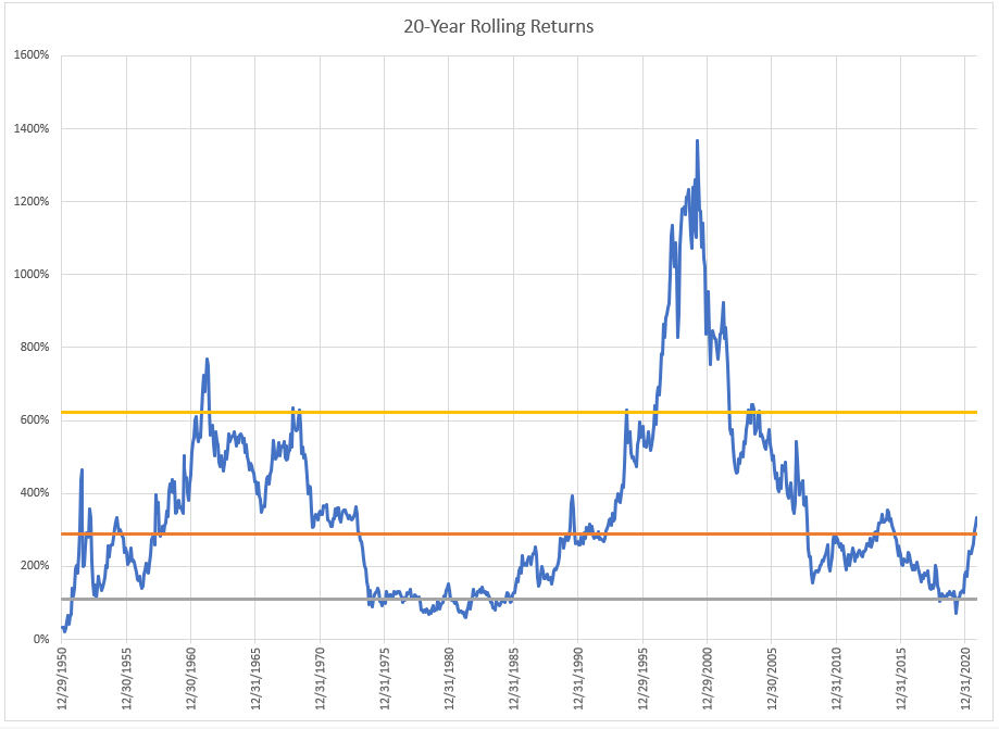
The middle orange line is the 50% percentile of returns. The top yellow line is the 90% percentile while the grey line is the 10% percentile.
The 12/31/2020 20-year rolling return was 184%, which was way lower than I expected. This just tells you how bad the 2000s were. What is also interesting is how we quickly have gone from under the 10% percentile to above the 50%. A function of the lookback dropping poor returns and good returns this year.
Looking at the 20-year, one would not say that the markets are high.
I also find the huge spike at the end of 1999 amazing on how much of an outlier it was.
This then got me thinking about how the 10-year and 5-year rolling returns look like.
10-Year Rolling Returns
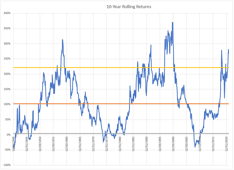
Now the 10-year does show you how strong the markets have been this past decade. The total return is clearly in the top decile.
5-Year Rolling Returns
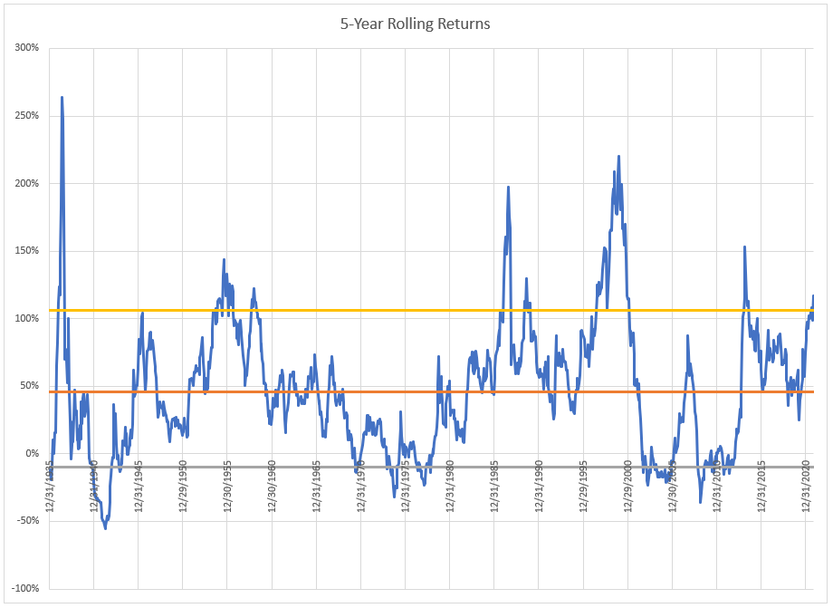
I was expecting the current 5-year return to be much higher compared to the historical values. The market is still above 90% but just so.
Spreadsheet
Fill in the form below to get the spreadsheet with the data and formulas. You can use this to check out different time lengths or percentiles.
Final Thoughts
This analysis is always and fun and interesting. But at the end of the day, this changes nothing in my trading. Yes, the market does appear to be high in its returns but this does not mean a top is near.
Backtesting platform used: AmiBroker. Data provider: Norgate Data (referral link)
Good quant trading,

Fill in for free spreadsheet: